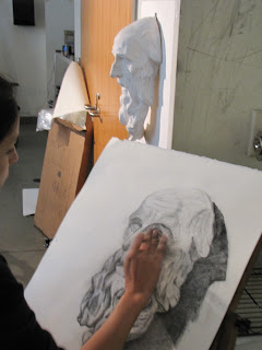
These kind of frighten me, and I'm not afraid of anything.
See more here:
http://www.designboom.com/weblog/cat/10/view/15992/yong-ho-ji-hybrid-human-tire-sculptures.html
Friday, October 7, 2011
Thursday, October 6, 2011
Changing educational paradigms
I've been teaching for a long time, and teaching never gets boring. We have to constantly tweak, reorganize, and occasionally overhaul our approach. This lecture/video clearly explains why it's so important now. Should be required viewing for everyone.
Friday, June 17, 2011
The term thus far......
Summer term is experienced at such a breakneck pace; I feel like I'm only hitting the high spots sometimes. With only 23 sessions, I suppose I am.
Week One: Time spent exploring media and exercises to develop seeing and some basic concepts like proportion, measuring, and plumb and level lines. Gesture drawings, simple tonal drawing (and working reductively), mark-making, ink wash and line, and looking at negative space and figure ground relationships. My mantra is "energy----draw with your shoulder, not your fingers! The energy perceived in a work is directly related to energy expended in making it". Homework this week was to set up their own still life, light it, and create an 18x24" tonal drawing using charcoal, chamois, and erasers. Emphasis is placed on drawing with the eraser, not just erasing mistakes with it.
90% enrolled in this class are NOT art majors, but they all (with an exception here and there) are really pushing themselves to develop in ways that are totally new to them.
Week Two: Contour line, searching line, calligraphic line, hatching, and cross-hatching. Homework was to copy an old master drawing (from a stack I offered) that focusing on line. Drawings were required to be 2x (or more) the size of the reproduction.

On Tuesday of Week 4, students selected a small object from a group of items I collected. Focusing on texture and pattern, they reproduced a small section of their object. We also watched a video from Art 21 about Veja Celmins.
Wednesday of Week 4 was a chance to take texture and pattern into collage. We looked at Picasso, Romare Bearden, and assorted other collage artists. I find that most students try to cram too much into their first collage, so we focused on keeping it simple and economical. Emphasis on pattern and texture.
Homework this week was to put the finishing touches on the cast drawing, drapery drawing and the collage. Images to come!
WHEW!!
Week One: Time spent exploring media and exercises to develop seeing and some basic concepts like proportion, measuring, and plumb and level lines. Gesture drawings, simple tonal drawing (and working reductively), mark-making, ink wash and line, and looking at negative space and figure ground relationships. My mantra is "energy----draw with your shoulder, not your fingers! The energy perceived in a work is directly related to energy expended in making it". Homework this week was to set up their own still life, light it, and create an 18x24" tonal drawing using charcoal, chamois, and erasers. Emphasis is placed on drawing with the eraser, not just erasing mistakes with it.
90% enrolled in this class are NOT art majors, but they all (with an exception here and there) are really pushing themselves to develop in ways that are totally new to them.
Week Two: Contour line, searching line, calligraphic line, hatching, and cross-hatching. Homework was to copy an old master drawing (from a stack I offered) that focusing on line. Drawings were required to be 2x (or more) the size of the reproduction.
Week Three: Value; we created value scales and talked about the 3 factors that influence value:
1. amount of illumination
2. local value
3. value of surrounding space
A short, simple value study from still life was completed, and then we began a longer study of cast drawings.
1. amount of illumination
2. local value
3. value of surrounding space
A short, simple value study from still life was completed, and then we began a longer study of cast drawings.

Week 4: Drapery Study. We looked at Leonardo's drapery studies, and talked about texture, shading and heightening (lightening with white).
 |
Leonardo da Vinci drapery study. |
Images to come, but here is the drapery still life (3 values). I think this is where the class started to hate me. They worked on grey Canson paper with black and white prismacolor pencils. The quality of these pencils really disturbs me. After years of not using them because they break constantly, I had finally started using them again because they seemed to be improving. I was wrong. Crappy. I recommend Derwent pencils instead.
On Tuesday of Week 4, students selected a small object from a group of items I collected. Focusing on texture and pattern, they reproduced a small section of their object. We also watched a video from Art 21 about Veja Celmins.
Wednesday of Week 4 was a chance to take texture and pattern into collage. We looked at Picasso, Romare Bearden, and assorted other collage artists. I find that most students try to cram too much into their first collage, so we focused on keeping it simple and economical. Emphasis on pattern and texture.
Homework this week was to put the finishing touches on the cast drawing, drapery drawing and the collage. Images to come!
WHEW!!
Thursday, May 26, 2011
Do Something.....
from a letter by Sol LeWitt to Eva Hesse....
Labels:
Artist Videos,
Inspiration,
Pearls of Wisdom
Monday, May 23, 2011
Anything is possible: William Kentridge
Kentridge uses drawings, video, music and the absurd to comment on complex personal and social situations. His work explores with a sense of play and discovery. 54 minutes.
http://video.pbs.org/video/1619754531/
The video is from PBS: Art:21 Series
The video is from PBS: Art:21 Series
Saturday, May 21, 2011
Sketchbooks
I can't stress enough how valuable a sketchbook can be to an artist. I encourage students to make your sketchbook personal; take it everywhere, paste into it, paint on it, scribble on it. Think of it as a visual connection between your mind, eyes and hand.
Here's a page out of one of my sketchbooks from 1986, when I was an undergrad:
There isn't a right or wrong way to work in your sketchbook, as long as you're working. Here are some more links to sketchbooks I think are interesting and well done. Enjoy!
Suzanne Stryk creates sketchbooks that are finished works of art in themselves. Very nature/scientific oriented.
http://suzannestryk.com/sketchbks/sketchbks.html
This is a link to very high resolution images of Leonardo da Vinci's sketchbooks, which are fascinating:
http://www.bl.uk/onlinegallery/ttp/leonardo/accessible/introduction.html
Kate Aspinall
http://kateaspinall.com/sketchbookspage.html
David Bell
http://www.davidbellstudio.com/sketchbooks.html
The Essence of Line. A database of French drawings from Ingres to Degas:
http://www.frenchdrawings.org/index.php
A collection of John Constable's sketchbooks (from Victoria and Albert Museum---one of my favorite, dusty, ole attic like museums :-)
http://www.vam.ac.uk/content/articles/a/constable_sketchbook/
Carlos Ferguson: the early years are better than 2004....
http://www.carlosferguson.com/Pages/Artwork/Archive/Books/Bk95.htm
Theodore Gericault's sketchbook (from the Getty)
http://www.getty.edu/art/gettyguide/artObjectDetails?artobj=506
J.M.W. Turner's sketchbooks (from the Tate)
http://www.tate.org.uk/servlet/BrowseGroup?cgroupid=999999995
Charles Ritchie (mostly ink wash/watercolor)
http://charlesritchie.com/sketchbooks.php
Zak Smith (may have mature content---visit at your own risk)
http://www.zaxart.com/sketchbook/
Drawing Rapture......
In defiance of the upcoming Rapture, I have decided to revive my teaching blog. I will be teaching Drawing I this summer term, and will use the blog in my classroom and to exhibit student work. Please consider following along, if you are so inclined.....
In the meantime, here is a student painting by Kay Thomas (from last semester):
In the meantime, here is a student painting by Kay Thomas (from last semester):
Subscribe to:
Comments (Atom)


