Wednesday, March 12, 2008
Watercolor: Student Work from Spring 2008
Mint Museum Portrait class Day 3 Student Work
Portrait Painting at the Mint: Day Three
Step One: I begin with a transparent monochrome as in Day One. Keep the paint thin and washy.
Step Two: I add ultramarine blue to my burnt sienna to create a darker value. Then I paint in the shadow on my model. I add a value to my negative space (background). My paint has a little more body than in Step One, but not heavy.

Step Three: I add a touch of white to some burnt sienna, and paint in the mid tones. I use a dry brush to blend tones a little; but try to not over blend at this point. I’ll actually be covering a lot of this up in later steps. However, since I will be glazing color over this, I don’t want my surface to have a lot of ridges. It will catch the glazes and make streaks on my painting.

Step Four: I mix a lighter value using burnt sienna and white and paint in areas of light. I redraw as needed at any step along the way. For example, one ear was considerably higher than the other….Again, I may use a dry brush to blend a little if desired. Occasionally I like to pretend I’m Leonardo da Vinci and smear a little with my thumb or fingers, but somehow it never measures up….I just keep trying.

Step Five: I mix an even lighter version of burnt sienna and white and painting in highlights. I also refine tones in between.
Remember to look for the six categories of light as listed in your Day One handout:
1. Highlight: (nose, brow bone, cheek on my model)
2. Light: (turn of the cheek, forehead)
3. Shadow: (side of the nose, side of the face)
4. Core of Shadow: (right side of cheek, nose, under eyebrows)
5. Reflected Light: (right edge of jaw, neck)
6. Cast Shadow: (under nose, neck)

Helpful Hints: Always work from general tones to more specific ones. For example, don’t get caught up in details like the eyelids until you’ve created a general pattern of light and dark. I always start with the three basics: shadow, midtone (or halftone) and light, then refine from there.
Next week we will focus on adding color and color temperature to the underpainting created today
Friday, February 29, 2008
Portrait Painting at the Mint: Day Two
We are working with a limited palette: Titanium white, cad yellow med., cad red med. Ultramarine blue, burnt sienna, raw sienna (or yellow ochre) and burnt umber
Step by step example:

Step One: Transparent monochrome
Using burnt sienna (it’s warm and transparent), sketch in the structure of the face and indicate light direction. Don’t worry about details; work from the general at this stage. Your paint should be fairly thin…use a rag to wipe back into it.

Step Two: Lay in shadows. Combine a little burnt umber to your burnt sienna. Paint should be thin, but not watery. Check proportions, redraw if needed. Be sure to also address negative space…remember, you will be creating edges via value and color shifts rather than line…Reminder: shadows are warm

Step Three: Halftone Halftone is cool….I used raw sienna (or yellow ochre), a touch of cad red (or you could use alizarin crimson), a bit of white….then I added just a touch of ultramarine blue to cool it down. What you don’t want to have is green---you’re looking for a neutral that’s a bit cool.
I’m still not too worried about details

Step Four and Five: Light and some details. Light is warm. I mixed a flesh tone that was a bit on the peachy side…same combination as above, but I omitted the blue and added a bit of cad yellow.
Compared to the Rubens portrait on page one, my model’s skin tone is darker and more olive.
At this point, I allow myself to take out a smaller brush, and develop some of the details, such as the eyes. I still keep it loose.

The Final Stage: Highlights and refining. Once I’ve laid in all the basic information (as in steps 1-5), then I mix a very light, slightly cool flesh tone. Remember, white is cool, so if you add quite a bit of white to your paint, it will be cool. But, use highlights sparingly or it will turn your painting "chalky".
I also refine any other areas that need it…if the paint isn’t quite thick enough, or if I need to move a shadow slightly.
I also darken the negative space. I could certainly refine more, but this is all the time I allowed for this sketch.....
Some helpful hints: Don’t try to blend too much. Strokes of varying value and color are far more interesting than continuous tone in a portrait like this. Flesh tone is not a single color you mix up and apply to your canvas…it’s an effect you create by laying related colors side by side. .
Monday, February 25, 2008
Jiha Moon at the Mint Museum
I'm always pleading about quality of line to my students...and Moon uses line to it's fullest possibilities....it's descriptive, calligraphic, sexy and mysterious. Yes, I said sexy. I'm less enthralled by the color...but maybe that's just me. I think color takes a back seat to line and value in these paintings, for the most part, though Peach Heaven probably makes a liar out of me.
Peach Heaven
(reprinted from www.mintmuseum.org)
And, it's a lot of fun to see someone work on such beautiful paper...yes, I know this is a nod to history, but it's so darn beautiful just on it's own. Whenever I see such beautiful paper, I think about how we often get paralyzed by the preciousness of the materials....the paper is soooo beautiful, how could one ever make something to live up to the innate beauty of the it? Obviously, this is not something Moon has to struggle with....she enhances all those qualities inherent in the paper, as well as history and infuses them with contempory references that suddenly don't seem so out of place.
It's a small show, but you can spend a lot of time looking at these. I have to admit, the Made in China exhibit doesn't do much for me, but I did notice two recently installed Eric Fischl lithographs as I walked through the permanent collection. I thought they were watercolors at first.
You can see more of Jiha Moon's work at www.jihamoon.com .
Thursday, February 21, 2008
Portrait Painting at the Mint: Day One
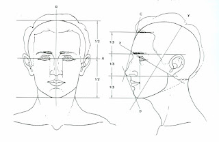
Review proportions:

Guidelines for the placement of features:
Note in Fig. A that the face is divided into halves from the top of the skull to the bottom of the chin.
The eyes are the midpoint.
Note in Fig. B that the features are divided into thirds; the hairline to the brow bone is one third. The brow bone to the base of the nose is another third. The base of the nose to the bottom of the chin is another third.
Further, the section from the bottom of the nose to the chin can be subdivided into thirds, with the lips located about one third of the way down.
Note the location of the ears within the middle third of the features. Also, note the slope of the face in profile view; this may change greatly depending on the individual; there is no substitute for really looking at your model---remember, these are just guidelines.
Find key reference points and mark them lightly on your canvas/paper. You can use charcoal, conte, or a brush. Pay attention to placement on the picture plane
Begin a transparent monochrome with thinned burnt sienna. Have a rag handy to wipe back into the image. This is when you make major decisions about drawing. Don’t skimp on this. Note the image above (by Chris Saper: visit http://www.chrissaper.com/ )
Now let’s look at the six categories of light on this Rubens painting and note whether they are warm or cool:
1. Highlight is cool. The lightest value, cool color paint on an object.
2. Light is warm. The next lightest value, warm color paint - and it continues to get lighter still as it approaches the area of highlight.
3. Halftone (where light and shadow meet) is cool. A mid-value, cooler color paint where light begins to turn into shadow - but can't be defined as either light or shadow.
4. Shadow is warm. A dark value, warm color paint.
5. Deep Shadow (cast shadow at the origin) is hot. Darkest value, hottest color paint.
6. Reflected light within a shadow is as close to pure color as you can make it. The reflected light should match the value of the shadow and it can be either warm or cool in color.
reference: http://forum.portraitartist.com/showthread.php?t=281
Begin by mixing a warm neutral for shadow, and paint the corresponding areas on your monochrome. Your paint should be thinned a little, but not transparent. As you apply the paint, think like a sculptor---as if you are building the planes of the face. Place your strokes in the direction of the plane. I will demo mixing the colors....
Next, mix a slightly cool neutral that is lighter than your shadow. Apply this to your halftone areas.
This should take us through the first day.....see you next Thursday!
Saturday, February 16, 2008
Watercolor--Agenda and Homework from Feb. 15
Morning: Meet in Overcash 151/call roll/turn in homework and Scarlet project (okay, some of you want to hold onto this until the last minute....must be into me by Wednesday, Feb. 20)

We will work on a still life from an unusual point of view---from above, below, or an extreme close up. Points to remember about composition:
Open composition: active; gives the impression that the composition extends beyond the edge of the picture plane. Concentrate on movement, rhythm and texture. Work on creating realistic imagery, but moving the eye through the picture plane through abstract elements.
We talked about negative space and the symbiotic relationship of positive and negative space. In short, if your negative space isn't interesting, it's unlikely that your composition will be interesting.
Painting I: Illustration Historically, artists like Albrect Durer (far left) used watercolor to “color in” their drawings. This usually means layers of color (allow them to dry in between) and precision---so, little or no wet-in-wet techniques. Much like illustrations seen over the years.(left)This should be postcard size or larger. Choose an object and reproduce it as faithfully as you possibly can. Try to be very objective in your representation. This will take some time; don’t wait until the day before to do it. (Clarification: Durer does introduce washes into his watercolors as well, which leads to the exploration of the spontaneous qualities of the medium, but you see this more in his landscapes.)
Possible subject matter: single flower, butterfly, insect, etc. Think images like botanical illustrations or Audubon.

Artists like Paul Cezanne use line and wash to explore composition, color relationships, light references. Working about 8x10” or larger, combine the two mediums of watercolor and graphite to offer a subjective view of the subject of your choice. Line and color should play equal parts in the composition.
This painting should be loose....limit your working time to about 45 minutes to 1 hour----no more!