Wednesday, January 30, 2008
Gallery Reception today --- Jan. 30
Tuesday, January 29, 2008
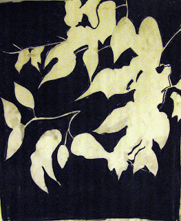
Drawing I Positive/Negative Exercise

ART 131, January 28, 2008, last exercise of the day
Some "blog worthy" samples..................


Thursday, January 24, 2008
What if.........
Wednesday, January 23, 2008
Class Exercise---intro to ink and ink wash

Ink wash samples....
Sunday, January 20, 2008
Drawing I---First exercise
 Drawing I, Spring 2008, First Exercise!
I'm really proud of this class---they jumped in, listened, and even though they didn't get to finish the first drawing, it was successful across the board. Sorry for the lousy slide....operator error. Students were asked to tone their paper, and using charcoal, a chamois, and erasers, draw from the still life set up; working reductively and adding details with charcoal.
 First Drawing, Sherrin
 First Drawing
Malinda Balcom.

First Drawing
Nicole Rivera

First Drawing, Yll
Keep up the good work Drawing I students!
Tuesday, January 15, 2008
Watercolor Assignment
Get to know your palette….here are the colors you’ve been asked to have on hand
Cadmium Red (Primary)
alizarin crimson (Primary)
Lemon yellow (Primary)
Cadmium yellow (Primary)
Yellow ochre or raw sienna (Primary)
Burnt sienna (Tertiary)
Burnt umber (Tertiary)
Viridian (Secondary)
cobalt blue (Primary)
Cerulean blue (Primary)
Winsor blue (phtalo blue) (Primary)
Payne’s gray (Tertiary)
Perm. Sap green (additional color)
Indigo (additional color)
Permanent Rose (additional color)
Violet (additional color---this one is tough to mix)
First of all, we all know that on the basic color wheel we’re all taught, there are only three primaries. But considering the transparency of watercolor and the trickiness of mixing for beginners; we’re going to start with 6 primaries----a warm and cool of each of the three main primary colors (red, yellow and blue).
Begin with a sheet of watercolor paper. You won’t need to stretch it; and these are just exercises, so don’t waste the paper. I estimate you’ll need about a 16x20” (give or take a little) to do this. Or you can do it on smaller pieces---or directly in your sketchbook. Think about your traditional color wheel, and paint a shape (such as the pie shape) using your six primaries:
 You will paint this on dry paper, and be sure to clean your brush thoroughly when you change colors. Paint them large enough that your can really see the color---several inches at least. You will notice that there is a warm and cool version of each color.
The most vibrant and intense secondary colors (colors made by mixing two primaries) are made by mixing primaries that have the same bias (i.e., cool primaries together, and warm primaries together).

Mixing primaries of opposite bias will give you a more muted secondary color. So, mix a warm primary with a cool primary:

There is no substitute for experience. Sometimes you’ll want to create layers of color---like glazing in oils, this can create a very luminous effect. So, let’s see what happens when we try some Overpainting effects:
 The colors listed are simply samples. Mix from your own palette, and be sure to label it. This will be a great resource for your sketchbook.
Hint for oil painters…blending isn’t a good idea here…lay the color down with a sure stroke, then layer the next color over it. Experiment with how much you let it dry between applications---you’ll get different effects that way.
Transparent and opaque colors:
Theoretically, all watercolors are transparent, and it is this quality that characterizes the medium. However, some pigments are slightly more opaque than others, the most transparent colors being the dye-based ones such as alizarin crimson, sap green, and phthalo (or Winsor) blue and Panyne’s gray. Lemon yellow, yellow ocher, and cerulean blue are all relatively opaque, so they can be used to lighten the tone of a darker color beneath, or to amend it if required. Printed directly from The Watercolor Artist’s Bible by Marylin Scott.

Granular Effects: Some colors tend to “break up” when you add water, so it’s good to have a reference for ones that have this tendency.

Click here for a printable version of this assignment.


