Showing posts with label Inspiration. Show all posts

Friday, October 7, 2011

Thursday, May 26, 2011

Do Something.....

from a letter by Sol LeWitt to Eva Hesse....

Saturday, May 21, 2011

Sketchbooks

I can't stress enough how valuable a sketchbook can be to an artist.  I encourage students to make your sketchbook personal; take it everywhere, paste into it, paint on it, scribble on it. Think of it as a visual connection between your mind, eyes and hand.


Here's a page out of one of my sketchbooks from 1986, when I was an undergrad:


There isn't a right or wrong way to work in your sketchbook, as long as you're working.  Here are some more links to sketchbooks I think are interesting and well done. Enjoy!

Suzanne Stryk creates sketchbooks that are finished works of art in themselves. Very nature/scientific oriented.
  http://suzannestryk.com/sketchbks/sketchbks.html

This is a link to very high resolution images of Leonardo da Vinci's sketchbooks, which are fascinating:
http://www.bl.uk/onlinegallery/ttp/leonardo/accessible/introduction.html

Kate Aspinall
http://kateaspinall.com/sketchbookspage.html

David Bell
http://www.davidbellstudio.com/sketchbooks.html

The Essence of Line. A database of  French drawings from Ingres to Degas:
http://www.frenchdrawings.org/index.php

A collection of John Constable's sketchbooks (from Victoria and Albert Museum---one of my favorite, dusty, ole attic like museums :-)
http://www.vam.ac.uk/content/articles/a/constable_sketchbook/

Carlos Ferguson: the early years are better than 2004....
http://www.carlosferguson.com/Pages/Artwork/Archive/Books/Bk95.htm

Theodore Gericault's sketchbook (from the Getty)
http://www.getty.edu/art/gettyguide/artObjectDetails?artobj=506

J.M.W. Turner's sketchbooks (from the Tate)
http://www.tate.org.uk/servlet/BrowseGroup?cgroupid=999999995

Charles Ritchie (mostly ink wash/watercolor)
http://charlesritchie.com/sketchbooks.php

Zak Smith (may have mature content---visit at your own risk)
http://www.zaxart.com/sketchbook/

Thursday, May 1, 2008

Favorite quote from the Jon Houghton workshop


Jon Houghton, Nicole, watercolor demo

Jon did this demo...sorry, this was the best slide I got of it and he took the portrait with him. Anyway, he carefully drew her features and then mixed up a flesh tone and THREW it on the paper! We all gasped. He laughed and said something about "it can't get any worse now". Then he proceeded to create this lovely work. But, it was a valuable lesson even for me----you cannot be afraid to make mistakes. A certain and deliberate boldness is liberating. I also noticed an economy of marks---I know my students have heard this before....if you can say it with one stroke---why use twenty?

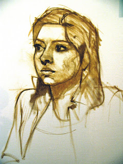
This is an oil sketch demo Jon did of Nicole as well. Lovely. I will post his portrait of Tamra (aka Michelle :-) as soon as I get a good slide of it.

But my favorite quote: "The mind cannot comprehend what the rear cannot endure".


Thursday, April 17, 2008

Jon Houghton Portrait Workshop at CPCC


Jon Houghton is a portrait artist who lives and works in Florida and has given an annual (or semi-annual) portrait workshop with Elizabeth Ross for years. We have reached capacity on this year's workshop already!
Here is the schedule: Please note: I have corrected the dates.
Thursday night (April 24): Demo in oil, Overcash 159, Central Campus 6pm (ish).
Friday morning (April 25) Demo in watercolor, Overcash 159, 9:30am; afternoon...work, work, work. Remember, Elizabeth Ross reception at 5pm!
Sat. morning (April 26) work, work, work.....10am till 4pm(ish)
Here is Jon's supply list:
All: vine charcoal (soft or medium), newsprint pad (16x20 or larger)
Kneaded eraser, chamois cloth, small pencil sharpener.

If using Oils:
Palette, Turpenoid, canvases or panels (16 x 20 to 20 x 24), a medium,
rags or paper towels,
Paints: ivory black, raw sienna, yellow ochre, cadmium yellow medium, cadmium red light, alizarin crimson, burnt sienna, raw umber, burnt umber, white (any kind), sap green. This list is just the colors used in flesh tones. Bring what ever other colors you
like as well.
Brushes: I use all kinds and sizes, but they are all in good condition. Don't bring a
bunch of old dried "sticks" with clotted bristles. I'd say the minimum set would be
4 filbert bristles in sizes 2, 4, 6, 8, and a small detail brushes like a
"Monarch" no. 2, and 4, another detail brush is the W&N university series synthetic.

Pastels:
As many as you can bring. I use a set of Nu-pastels and a complete 330 stick set
of the old Grumbacher pastels, I also have a number of Rembrandts, schminckes, and
others. You simply can't do much without a variety of colors.

Watercolors:
Most watercolorists will have the paints they need. If you want to be sure, check the list of oil colors and add cerulean blue. No white necessary of course. Brushes should be good quality sables including at least one size 8 brush, (Raphael, W&N series 7, or something equivalent. For paper, I use d'Arches 140 pound cold press or something equivalent like Fabriano. For workshops I usually divide the paper into halfs or quarters ( 15 x 11). Their are many good plastic palettes available. It should have plenty of room to mix and sections for pure color.
And here are some more examples of Jon's work:


Monday, February 25, 2008

Jiha Moon at the Mint Museum


Typhoon
(reprinted from www.mintmuseum.org)

I had the opportunity to see Jiha Moon's exhibit at the Mint on Randolph Road last week. Sometimes when you see "smart" art, it translates as boring art. Not here. There is an infectious, youthful absorption in her work....like she is discovering moment by moment with the wonder of a child. That sense of discovery is balanced by the very deliberate references to historical artisms and contemporary pop culture. I generally grimace at pop culture references....they just seem so shallow next to...well, everything. She explores them with equal zeal...I don't think she promotes the idea that one is bad and the other is not. All references are just toys in the sandbox.
I'm always pleading about quality of line to my students...and Moon uses line to it's fullest possibilities....it's descriptive, calligraphic, sexy and mysterious. Yes, I said sexy. I'm less enthralled by the color...but maybe that's just me. I think color takes a back seat to line and value in these paintings, for the most part, though Peach Heaven probably makes a liar out of me.

Peach Heaven
(reprinted from www.mintmuseum.org)

And, it's a lot of fun to see someone work on such beautiful paper...yes, I know this is a nod to history, but it's so darn beautiful just on it's own. Whenever I see such beautiful paper, I think about how we often get paralyzed by the preciousness of the materials....the paper is soooo beautiful, how could one ever make something to live up to the innate beauty of the it? Obviously, this is not something Moon has to struggle with....she enhances all those qualities inherent in the paper, as well as history and infuses them with contempory references that suddenly don't seem so out of place.

It's a small show, but you can spend a lot of time looking at these. I have to admit, the Made in China exhibit doesn't do much for me, but I did notice two recently installed Eric Fischl lithographs as I walked through the permanent collection. I thought they were watercolors at first.

You can see more of Jiha Moon's work at www.jihamoon.com .

Thursday, January 24, 2008

What if.........

What if I told you to create a drawing using a single contour line? No, you can't shade, you can't overlap....just a single contour line to describe the form you're drawing. What would you do?

Would it look something like this?


The contour line begins at the tip of his nose and spirals around...
Thanks to Carolyn Greer for sending me this.....

Wednesday, January 23, 2008

Ink wash samples....

These are posted to inspire (specifically, my Drawing I class)....... I can't recall where I've collected all these images, but I will attribute where I can....


Yes, this is ink......


A Delacroix Landscape

Richard Diebenkorn
H. Tokahu
A student ink drawing (mostly line)

Both of these are by Rembrandt....note the drybrushing in Sleeping Woman.

J. Piper
Jim Dine


All by Victor Hugo


Yes, this is ink....and yes, it scares me a little. I can't find the artist's name...sorry.


These two are watercolor, but the techniques are essentially the same as ink....
The one on the left is Mondrian....I believe the one on the right is Luks.
I adore the Mondrian...

Thursday, December 27, 2007

Jasper Johns "Gray" and the Art Institute of Chicago

The Art Institute in Chicago is currently exhibiting Jasper Johns Gray, a sprawling collection of mostly monochromatic works. While I have certainly looked at Johns before, I was taken aback by the variation and continuity of the work. The subtlety was actually quietly stunning. There weren't a lot of pieces that wowed me individually, but as a whole, it is more than the sum of its parts.

One that did wow me was Diver. This is a breathtaking drawing in person...it's large; 6 or 7 feet tall, on paper mounted on canvas. The warmth of the underpainting is just luscious. The image reverberates from the downward thrust of a dive, to the two-dimensionality of the mark making and the hand prints. It is movement and static all at once. And a lovely catalog to boot. I believe it moves to the Metropolitian next. Visit http://www.artic.edu/aic/exhibitions/exhibition/johns for more info.

Also on display was a photo exhibit: Girls on the Verge. You know...I am mostly bored by photography, and this was no exception.


The permanent collection is strong in painting...I was pleased to see Cailebotte again....I didn't realize that he never sold a painting in his lifetime until I read it the other day. The museum has a number of big names; Picasso, Monet, van Goghs....a few lovely Corots.

I don't recall seeing Manet's The Mocking of Christ during previous visits...what a stark and haunting painting. The figure is so incredibly high key it almost leaps off the picture plane.


And John Singer Sargent's The Fountain is just lovely. I just get this pure sensual joy looking at his color and brushwork.

The minaiture room is fun; the American collection is good. The Asian collection, well, I don't know enough about it to know if it's good. I wasn't too impressed by anything pre-17th century.....so Egypt, Rome, etc. were small (hopefully, I didn't just miss them, but I was struggling to see everything in one day, so who knows?). Some of the galleries were closed due to the construction/renovation on the Modern wing.


Upcoming exhibits for Spring 2008 include Edward Hopper and a show of Winslow Homer watercolors (a must see, I think).

Tuesday, November 13, 2007

Artists you should know....


April Gornik, China Light, 2004, Oil on linen, 25" x 28"


She really blows me away. This makes landscape painting interesting to me again. Check out her website at http://www.aprilgornik.com/ . She's recently put up some new work, and it's lovely. Here's a new one:

April Gornik, Dune Sky, 2007, Oil on linen, 70" x 81"


Thursday, November 8, 2007

Contemporary Cool and Collected at the Mint Museum


I viewed the new Mint Museum exhibit Contemporary Cool and Collected yesterday. A good exhibit...though I wish it were a little stronger on painting. Here are a few of my favorite highlights:
Lalla Essaydi, Converging Territories #7
Chromogenic print, 30x40"

What an absolutely stunning piece! Here's a statement about her work from http://www.aperture.org/ :

Lalla Essaydi's photographs deal with a rebellion against the limited domain of the female within Islamic traditions. As noted in Nazar: Photographs from the Arab World (Aperture, 2005), according to Islamic tradition, the street is the domain of men, and women are condemned to live indoors. Behind closed doors, they are nothing more than decoration, suggests Essaydi, a situation she that she vividly represents in Converging Territories, which appeared in the spring 2005 issue of Aperture magazine alongside a text written by Isolde Brielmaier. Essaydi places Islamic women in isolated spaces and literally decorates them with texts written in henna. The texts-a reversal of the silence of their isolation-give the women a voice, with which they can speak to the space and to one another. The rebellious character of the photographs is magnified by the fact that within Islam calligraphy cannot be practiced by women. Converging Territories, #30 was photographed in the house where women and girls from the artist's family were locked up, sometimes for weeks, when they transgressed the rules of Islam. Essaydi herself was sent to this space as a youth; escorted by silent servants, she would be left alone for up to a month. As Isolde Brielmaier notes, "her intention and introspection are evident in her photographs: we see Essaydi turning 'space' into something more than just the delimited enclosures of that house of her childhood." Brielmaier goes on to say that "at a time when many images in circulation portray Arab people in increasingly negative ways, Essaydi reclaims and reconsiders ideas of what it means to be Arab and female on her own terms."


Shana and Robert ParkeHarrison, Mourning Cloak, photogravure, 55 x60"


The info card by this image states that the butterflies "act as a shield, protecting Everyman from his empty existence; or implies a richer existence by interacting with the natural world." As I looked at this I couldn't help but wonder why the Chrisian symbolism of butterflies isn't mentioned...it's a clear symbol of resurrection.....


Tony Oursler, Invisible Green Link?, aluminum, acrylic, LCD screen, DVD player

I love it when I get surprised...it's not necessarily a new idea for the artwork to cause you to reverse viewpoints and recognize yourself as the work to be viewed; but I wasn't expecting it for some reason.

Stephanie Pryor, Untitled (painting light blue background), acrylic paint and acrylic ink on gessoed board.

A lovely little poem on canvas. Beautifully crafted and suggestive. But I'm sick of pieces titled Untitled.

The Elizabeth Murray painting Split and Join is probably my least favorite of all I've ever seen of hers. I got a kick out of Tara Donavon's Controlled Caging, and of course, Josef Koudelka's Untitled (Coal Mining Started in the Region around the Year 1400) was haunting to me. All in all, a worthwhile show. Take some time and enjoy it :-)


Monday, November 5, 2007

Teaching Schedule for Spring 2008

Tentatively, my teaching schedule for Spring 2008 is:


Watercolor on Fridays (all day class---9:30--3ish)
Drawing I on Monday/Wednesday 12:30-3:20
Art Appreciation online

*This schedule is subject to change*

This painting is by Ron Isaacs, my old painting professor at EKU.
And yes, that's me and my beloved dog Angel! Here's the full painting:

His work is pretty incredible, and so beautifully crafted.
Of course, it has nothing to do with my teaching schedule---I just thought I'd give you something interesting to look at :-)