In the meantime, here is a student painting by Kay Thomas (from last semester):


 Jon Houghton, Nicole, watercolor demo
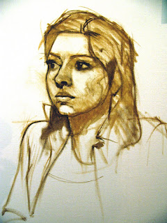
This is an oil sketch demo Jon did of Nicole as well. Lovely. I will post his portrait of Tamra (aka Michelle :-) as soon as I get a good slide of it.
But my favorite quote: "The mind cannot comprehend what the rear cannot endure".


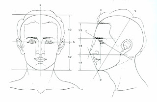
Guidelines for the placement of features:
Note in Fig. A that the face is divided into halves from the top of the skull to the bottom of the chin.
The eyes are the midpoint.
Note in Fig. B that the features are divided into thirds; the hairline to the brow bone is one third. The brow bone to the base of the nose is another third. The base of the nose to the bottom of the chin is another third.
Further, the section from the bottom of the nose to the chin can be subdivided into thirds, with the lips located about one third of the way down.
Note the location of the ears within the middle third of the features. Also, note the slope of the face in profile view; this may change greatly depending on the individual; there is no substitute for really looking at your model---remember, these are just guidelines.
 Find key reference points and mark them lightly on your canvas/paper. You can use charcoal, conte, or a brush. Pay attention to placement on the picture plane
Begin a transparent monochrome with thinned burnt sienna. Have a rag handy to wipe back into the image. This is when you make major decisions about drawing. Don’t skimp on this. Note the image above (by Chris Saper: visit http://www.chrissaper.com/ )
 Now let’s look at the six categories of light on this Rubens painting and note whether they are warm or cool:
1. Highlight is cool. The lightest value, cool color paint on an object.
2. Light is warm. The next lightest value, warm color paint - and it continues to get lighter still as it approaches the area of highlight.
3. Halftone (where light and shadow meet) is cool. A mid-value, cooler color paint where light begins to turn into shadow - but can't be defined as either light or shadow.
4. Shadow is warm. A dark value, warm color paint.
5. Deep Shadow (cast shadow at the origin) is hot. Darkest value, hottest color paint.
6. Reflected light within a shadow is as close to pure color as you can make it. The reflected light should match the value of the shadow and it can be either warm or cool in color.
reference: http://forum.portraitartist.com/showthread.php?t=281
Begin by mixing a warm neutral for shadow, and paint the corresponding areas on your monochrome. Your paint should be thinned a little, but not transparent. As you apply the paint, think like a sculptor---as if you are building the planes of the face. Place your strokes in the direction of the plane. I will demo mixing the colors....
Next, mix a slightly cool neutral that is lighter than your shadow. Apply this to your halftone areas.
This should take us through the first day.....see you next Thursday!


 First, as few words about value: Value is the relative lightness or darkness of an object or space
Value is relative to three things:
1. local value (the value of something in even lighting conditions)
2. value of surrounding area
3. amount of illumination
When creating a drawing using chiaroscuro, we look for six categories of light:
 Because we are using grey paper, one of the categories will be the local value of the paper.
We will shade with the black for shades darker than the paper, and heighten (lighten with white) for the areas lighter than the paper.

Left: Begin by lightly sketching a gesture drawing of the general dimensions of the head, including the shoulders. Check you proportions now. You are using only your black conte.
Center: Find the major bones/structure of the face and lightly suggest shadows. No harsh lines or edges here….you’re still looking, measuring, checking proportions. Still using only black conte.
Right: Keep defining shadows, looking at structure. Start to build up darks. If you are using a stick of conte, snap it into a small section and use the side to build the planes of the face. Remember, you are only shading the areas darker than the gray of your paper.

Once the structure is “set” and you are satisfied with the likeness, push the values and work on edge quality. Soften edges that you want to fade out, and emphasize edges that are hard planes (though you won’t find many of those). If you can’t see details, don’t include them. Draw what you see.
 The last step is to add the highlights. It doesn’t take much in terms of highlights to enhance the roundness of the form. A common mistake is to add too many whites, and flatten the face, so use them sparingly.
Reference: The Artist’s Complete Guide to Drawing the Head, William L. Maugham


 In these illustrations, notice how the features are aligned;


|
|
| Subscribe to Whitman Studio |
| Visit this group |