Friday, February 29, 2008

Portrait Painting at the Mint: Day Two


We are working with a limited palette: Titanium white, cad yellow med., cad red med. Ultramarine blue, burnt sienna, raw sienna (or yellow ochre) and burnt umber
Step by step example:

Step One: Transparent monochrome
Using burnt sienna (it’s warm and transparent), sketch in the structure of the face and indicate light direction. Don’t worry about details; work from the general at this stage. Your paint should be fairly thin…use a rag to wipe back into it.


Step Two: Lay in shadows. Combine a little burnt umber to your burnt sienna. Paint should be thin, but not watery. Check proportions, redraw if needed. Be sure to also address negative space…remember, you will be creating edges via value and color shifts rather than line…Reminder: shadows are warm

Step Three: Halftone Halftone is cool….I used raw sienna (or yellow ochre), a touch of cad red (or you could use alizarin crimson), a bit of white….then I added just a touch of ultramarine blue to cool it down. What you don’t want to have is green---you’re looking for a neutral that’s a bit cool.
I’m still not too worried about details

Step Four and Five: Light and some details. Light is warm. I mixed a flesh tone that was a bit on the peachy side…same combination as above, but I omitted the blue and added a bit of cad yellow.
Compared to the Rubens portrait on page one, my model’s skin tone is darker and more olive.

At this point, I allow myself to take out a smaller brush, and develop some of the details, such as the eyes. I still keep it loose.

The Final Stage: Highlights and refining. Once I’ve laid in all the basic information (as in steps 1-5), then I mix a very light, slightly cool flesh tone. Remember, white is cool, so if you add quite a bit of white to your paint, it will be cool. But, use highlights sparingly or it will turn your painting "chalky".
I also refine any other areas that need it…if the paint isn’t quite thick enough, or if I need to move a shadow slightly.
I also darken the negative space. I could certainly refine more, but this is all the time I allowed for this sketch.....

Some helpful hints: Don’t try to blend too much. Strokes of varying value and color are far more interesting than continuous tone in a portrait like this. Flesh tone is not a single color you mix up and apply to your canvas…it’s an effect you create by laying related colors side by side. .

Monday, February 25, 2008

Jiha Moon at the Mint Museum


Typhoon
(reprinted from www.mintmuseum.org)

I had the opportunity to see Jiha Moon's exhibit at the Mint on Randolph Road last week. Sometimes when you see "smart" art, it translates as boring art. Not here. There is an infectious, youthful absorption in her work....like she is discovering moment by moment with the wonder of a child. That sense of discovery is balanced by the very deliberate references to historical artisms and contemporary pop culture. I generally grimace at pop culture references....they just seem so shallow next to...well, everything. She explores them with equal zeal...I don't think she promotes the idea that one is bad and the other is not. All references are just toys in the sandbox.
I'm always pleading about quality of line to my students...and Moon uses line to it's fullest possibilities....it's descriptive, calligraphic, sexy and mysterious. Yes, I said sexy. I'm less enthralled by the color...but maybe that's just me. I think color takes a back seat to line and value in these paintings, for the most part, though Peach Heaven probably makes a liar out of me.

Peach Heaven
(reprinted from www.mintmuseum.org)

And, it's a lot of fun to see someone work on such beautiful paper...yes, I know this is a nod to history, but it's so darn beautiful just on it's own. Whenever I see such beautiful paper, I think about how we often get paralyzed by the preciousness of the materials....the paper is soooo beautiful, how could one ever make something to live up to the innate beauty of the it? Obviously, this is not something Moon has to struggle with....she enhances all those qualities inherent in the paper, as well as history and infuses them with contempory references that suddenly don't seem so out of place.

It's a small show, but you can spend a lot of time looking at these. I have to admit, the Made in China exhibit doesn't do much for me, but I did notice two recently installed Eric Fischl lithographs as I walked through the permanent collection. I thought they were watercolors at first.

You can see more of Jiha Moon's work at www.jihamoon.com .

Thursday, February 21, 2008

Portrait Painting at the Mint: Day One

For the next four Thursdays I'll be conducting a portrait painting workshop at the Mint Museum. Here's a synopsis on what we will do on Day One.

Hints on lighting the model: Position a single light in front of the model, slightly to one side and slightly above the model. This is the best position to display the planes of the face, and enhance the three-dimensionality of the form. Multiple lights and full frontal lights will flatten the form, and lighting from below will create some exaggerated shadows. Look for the little triangle on the cheek opposite the light….
Review proportions:


Guidelines for the placement of features:
Note in Fig. A that the face is divided into halves from the top of the skull to the bottom of the chin.
The eyes are the midpoint.
Note in Fig. B that the features are divided into thirds; the hairline to the brow bone is one third. The brow bone to the base of the nose is another third. The base of the nose to the bottom of the chin is another third.
Further, the section from the bottom of the nose to the chin can be subdivided into thirds, with the lips located about one third of the way down.

Note the location of the ears within the middle third of the features. Also, note the slope of the face in profile view; this may change greatly depending on the individual; there is no substitute for really looking at your model---remember, these are just guidelines.

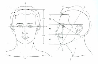
Find key reference points and mark them lightly on your canvas/paper. You can use charcoal, conte, or a brush. Pay attention to placement on the picture plane
Begin a transparent monochrome with thinned burnt sienna. Have a rag handy to wipe back into the image. This is when you make major decisions about drawing. Don’t skimp on this. Note the image above (by Chris Saper: visit http://www.chrissaper.com/ )

Now let’s look at the six categories of light on this Rubens painting and note whether they are warm or cool:
1. Highlight is cool. The lightest value, cool color paint on an object.
2. Light is warm. The next lightest value, warm color paint - and it continues to get lighter still as it approaches the area of highlight.
3. Halftone (where light and shadow meet) is cool. A mid-value, cooler color paint where light begins to turn into shadow - but can't be defined as either light or shadow.
4. Shadow is warm. A dark value, warm color paint.
5. Deep Shadow (cast shadow at the origin) is hot. Darkest value, hottest color paint.
6. Reflected light within a shadow is as close to pure color as you can make it. The reflected light should match the value of the shadow and it can be either warm or cool in color.
reference: http://forum.portraitartist.com/showthread.php?t=281


Begin by mixing a warm neutral for shadow, and paint the corresponding areas on your monochrome. Your paint should be thinned a little, but not transparent. As you apply the paint, think like a sculptor---as if you are building the planes of the face. Place your strokes in the direction of the plane. I will demo mixing the colors....
Next, mix a slightly cool neutral that is lighter than your shadow. Apply this to your halftone areas.

This should take us through the first day.....see you next Thursday!

Saturday, February 16, 2008

Watercolor--Agenda and Homework from Feb. 15

Here's what you missed Feb. 15

Class Agenda for Friday, February 15, 2008

Morning: Meet in Overcash 151/call roll/turn in homework and Scarlet project (okay, some of you want to hold onto this until the last minute....must be into me by Wednesday, Feb. 20)

Demo: (Future Soup, left) Composition and still life;
We will work on a still life from an unusual point of view---from above, below, or an extreme close up. Points to remember about composition:

Open composition: active; gives the impression that the composition extends beyond the edge of the picture plane. Concentrate on movement, rhythm and texture. Work on creating realistic imagery, but moving the eye through the picture plane through abstract elements.
We talked about negative space and the symbiotic relationship of positive and negative space. In short, if your negative space isn't interesting, it's unlikely that your composition will be interesting.

The demo focused on blocking in shapes and color relationships. Beginners have a tendency to jump right into details without establishing a foundation for those details.

Students then completed a still life using colorful fruits and veggies.

Homework for Feb. 22.
Painting I: Illustration Historically, artists like Albrect Durer (far left) used watercolor to “color in” their drawings. This usually means layers of color (allow them to dry in between) and precision---so, little or no wet-in-wet techniques. Much like illustrations seen over the years.(left)
This should be postcard size or larger. Choose an object and reproduce it as faithfully as you possibly can. Try to be very objective in your representation. This will take some time; don’t wait until the day before to do it. (Clarification: Durer does introduce washes into his watercolors as well, which leads to the exploration of the spontaneous qualities of the medium, but you see this more in his landscapes.)

Possible subject matter: single flower, butterfly, insect, etc. Think images like botanical illustrations or Audubon.
Painting II: Line and Wash


Artists like Paul Cezanne use line and wash to explore composition, color relationships, light references. Working about 8x10” or larger, combine the two mediums of watercolor and graphite to offer a subjective view of the subject of your choice. Line and color should play equal parts in the composition.

This painting should be loose....limit your working time to about 45 minutes to 1 hour----no more!


Interested in Private Lessons?

Since I am getting inquiries about private lessons, I have decided to consider it. If you are interested, please contact me at carol@carolynwhitman.com and we can chat. I will only consider serious students who are at least a mature 16 years or older.

Thursday, February 7, 2008

Watercolor: Student Work from Feb. 1 Part II

Here are some examples of small watercolors done as homework assignments. Students were asked to use an intense complementary palette in one, and a muted complementary palette in another. These represent just a few of images.....


Pam Hacker


Susie Copley


Laura Arbogast


Carol Connaughton


Carol Connaughton


Bob Brooks


Carolyn Greer


Dot Stiles


Dot Stiles


Watercolor: Student Work from Feb. 1 Part I

Students were asked to choose a section of a watercolor painting to copy. They tried to determine how the artist mixed and applied his/her pigments. Sargent and Homer were recommended


Laura Arbogast
Copy sketch of a Sargent watercolor


Heather Felts
Copy of Wyeth watercolor


Bob Brooks
Copy of Sargent watercolor


Carol Connaughton
Copy of Sargent watercolor


Wednesday, February 6, 2008

Class cancelled Feb. 6, 2008--Drawing I

I hate to do it, but I'm feeling poorly. But, the show must go on, and here are your assignments, all due Monday, Feb. 11, 2008:


In lieu of class today, it is IMPORTANT that you complete the following so you will be prepared for class Monday:
I have mentioned the upcoming exhibit about The Scarlet Letter to you. If you have never read the book, take a look at a brief synopsis by visiting www.sparknotes.com/lit/scarlet/ Our project for next week will center around contemporary views of the themes explored in the book, so having at least a basic knowledge of the text is important. Read the summary, and take a look at the section on themes and motifs. Think about how these might apply to society today.
Between now and Monday, collect the following items:
newspaper clippings, especially pictures
symbols of the letter A (for example; in the book The Scarlet Letter, A stands for Adultery, but today it could also stand for Abortion
Any other visual symbols of the themes, motifs or symbols in the book (There is a section about this in the website listed above)
Threads, ribbons or pearls you could collage into your work.
Next week will be fun and creative, but it's success hinges upon your research and collection of the above items.

As for drawing, here's your assignment:

Drawing I: Contour line Assignment

A contour is the visible border of an object in space. In this assignment, you will create a sense of depth through line variation. Warning: absolutely no shading!

Supplies: Ink pen (such as a Sharpie ultra fine point), white drawing paper (18x24 inches –2 sheets), a piece (or pieces) of fruit or vegetable for your still life. Note: you can use a nib/stylus or a bamboo pen* with bottled ink instead of an ink pen.

Step 1: Choose one or two pieces of fruit or vegetable to draw. Look for items that have an interesting edges or texture---this will make your drawing more interesting. Some suggestions include green peppers, melons, whole pineapple, cabbage, etc.
Step 2: Place one sheet of white paper on a flat surface to serve as a background for your still life. Cut, tear or partially eat your still life and then arrange it on the white paper.
Step 3: Take a look at your light source. The best light is a singe light source coming from above and to one side.
Step 4: In your sketchbook, draw several different compositions. Do this quickly, allowing only a minute or two for each small postcard size (or smaller) sketch.
Step 5: Choose one of your sketches and create a small (postcard size or smaller) positive/negative version of it. Take a look and ask yourself the following:
*Is the negative space interesting?
*Is there significantly more negative space than positive space?
*Are there any adjustments I can make to create a more interesting composition?
Step 6:Repeat steps 4 and 5 until you are satisfied with your composition.
Step 7: You may lightly draw your composition in pencil on the 18x24” sheet of paper. You will be drawing large---fill the entire 18x24” sheet of paper. This may mean you are increasing the scale of your still life dramatically, but will allow you to show a lot of detail. Eventually, you’ll want to work toward drawing directly in ink, but at this point using pencil is okay. Keep your paper as clean as possible though. No messy lines or messy erasing.
Step 8: Once you’ve completed your pencil underdrawing, begin to ink it in. Focus on line variation---make your line descriptive, but also focus on the beauty of the line. Vary the amount of pressure placed on the pen to create lines that are more interesting. Allow some lines to disappear and then find them again. The viewer’s eye will connect the missing edges.

An example: (reprinted from Drawing Basics by Jacklyn St. Aubyn, Harcourt Brace). More examples on Blackboard.

* If you’ve never used a bamboo pen before, note that you need to let the tip sit in the ink for about ten minutes or so before drawing. This allows it to absorb and hold in more readily.

Tuesday, February 5, 2008

Drawing I----Contour Line

Monday's Class: Contour line.
Students were asked to describe the visible border of an object in space by varying the width and pressure on the line, and investigating lost and found edges.


Malinda


Nicole


Janna

Yll

Sunday, February 3, 2008

Watercolor Agenda Feb. 1

ART 244 Watercolor Whitman
Class Agenda for Friday, Feb 1, 2008


9:30---10:15am: Meet in Overcash 151/call roll
Reminders: League for Innovation Competition flyer

Get started on assignment; turn in homework ( I will return these next week---with written comments) Please fill out a critique paper and place your work in my portfolio (on my table in 151).

10:30-11:30: Optional: Demo/Lecture on drawing basics. I’ll do this in Room 154 (Drawing Studio). You may work on your assignment, or attend this demo/lecture. Click here for a printable version of the lecture

11:30am---12:30pm: Lunch Break

After Lunch: Continue working on your assignment. If you complete one project; be prepared to start another one.


I realize that it’s a long day when critiques end at 3:30! So, I do not plan to begin critiques so late in the future. I do ask that you work until about 2:30; the last hour will be reserved for individual critiques as requested.

Next week: Abstraction: How To


Homework assignment Due next Friday Feb. 8

Again, there is no substitute for experience!! For this homework assignment, you’ll do a minimum of three (yes----3) small paintings, approximately postcard size, though you may work larger if you wish. Because these are so small they should take about 30 minutes to do each one. Some perhaps a little more, some a little less. Subject matter is up to you (except for #3---see below), but it should be fairly realistic….consider using still life as your subject matter, but whatever you choose, be sure you create an interesting composition, and try to incorporate some techniques learned in class. Be conscious of soft and hard edges, and creating the illusion of depth.

First painting: Use a cool palette.
Second painting: Use a warm palette
Third Painting: Find a watercolor image you really like and reproduce a section of it….it may be too time-consuming to complete a total copy; plus, you will be working rather small. You may work larger if you feel it’s necessary. So, choose a section that is representative of what you want to learn rather than the whole image. Try to figure out how the artist selected and mixed his/her colors. If you’re looking for artists….take a look at watercolors by John Singer Sargent, or Winslow Homer…….and bring the image with you for the next class---I want to see it. You'll be turning these in just as you did this week.


I'll scan and post some images asap. Ya'll are a great class!

Now, here's a little eye candy; you've earned it!


This is a lovely limited palette watercolor by Mondrian.....yes, Mondrian!