
Please note: Final Crit starts at 11am.
Please bring 6 drawings. One must be your final project.
Choose from the following list:
gesture line drawing
contour line drawing
value study
positive-negative drawing
photo reference project
hallway drawing
landscape
portrait
perspective drawing
trompe l'oeil drawing
drawing you consider your best from this semester
Bring money to order Chinese, or bring your lunch. I will bring a dessert treat for you :-)
Thursday, December 4, 2008
Figure Drawing, Fall 08 Final Class!
Hi Folks,
Friday, Dec. 5 is the final class for Figure Drawing, Fall 08. Here's the agenda:
9:30--11:30 Last drawing session (Greta is scheduled to model)
11:30--till 2: Pot luck lunch and group critique
Bring a contribution to the pot luck (I will provide Italian beef sandwiches and some killer banana puddin') and the following drawings:
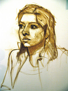
- Your outside project (self portrait conversation with a well known person)
- An early drawing---for comparison
- An example of line (can be gesture, contour, etc.)
- An example of a value study
- A portrait
- The drawing you feel is the most successful of the semester (could be one of the previous)
I have some of your drawings and will return them to you Friday. I look forward to it.
Carolyn
Saturday, November 15, 2008
Reference Photos for Perspective/Value Exam
ART 131 students: The Reference Photos are on Blackboard, in the Course Documents folder, labeled Reference Photos.
Those who were absent for the exam, will need to make it up outside of class time.
Carolyn
Those who were absent for the exam, will need to make it up outside of class time.
Carolyn
Thursday, October 30, 2008
Drawing I Homework
Great job on the hallway perspective today!! Here are a few reference photos to help you add value to your drawings. You may use pencil, charcoal or conte.


Friday, October 17, 2008
Figure Drawing Updates
Update on the next couple of weeks:
Homework due on October 24: Using some of your previous drawings, overlay the skeleton in the same manner as class on Oct. 17. You need to do at least three. I will post a link to some reference images asap.
In class on Friday Oct. 24 we will work on individual projects. Bring all your reference materials, supplies, etc. We will not have a model this day. Be sure to have good quality paper to work on.
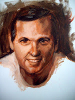
In class on Friday, Oct. 31 we will focus on portraits.
Homework due on October 24: Using some of your previous drawings, overlay the skeleton in the same manner as class on Oct. 17. You need to do at least three. I will post a link to some reference images asap.
In class on Friday Oct. 24 we will work on individual projects. Bring all your reference materials, supplies, etc. We will not have a model this day. Be sure to have good quality paper to work on.
In class on Friday, Oct. 31 we will focus on portraits.
Thursday, October 16, 2008
ART 131 Homework and what you'll need for Tuesday Oct. 21
Homework: If you didn't complete your in class assignment on Thursday, please finish it and post it to the hallway board by the beginning of class Tuesday.
For Tuesday, please bring a small, personal object that has meaning to you, and you think would be interesting to draw. Also bring assorted pencils and erasers. I will provide the paper.
For Tuesday, please bring a small, personal object that has meaning to you, and you think would be interesting to draw. Also bring assorted pencils and erasers. I will provide the paper.
Thursday, September 4, 2008
ART 131 Homework Assignment Due 9/9
A contour is the visible border of an object in space. In this assignment, you will create a sense of depth through line variation.
Warning: absolutely no shading!
Supplies: Ink pen (such as a Sharpie ultra fine point), white drawing paper (18x24 inches –2 sheets), a piece (or pieces) of fruit or vegetable for your still life.
Note: you can use a nib/stylus or a bamboo pen* with bottled ink instead of an ink pen.
Step 1: Choose one or two pieces of fruit or vegetable to draw. Look for items that have an interesting edges or texture---this will make your drawing more interesting. Some suggestions include green peppers, melons, whole pineapple, cabbage, etc.
Step 2: Place one sheet of white paper on a flat surface to serve as a background for your still life. Cut, tear or partially eat your still life and then arrange it on the white paper.
Step 3: Take a look at your light source. The best light is a singe light source coming from above and to one side.
Step 4: In your sketchbook, draw several different compositions. Do this quickly, allowing only a minute or two for each small postcard size (or smaller) sketch.
Step 5: Choose one of your sketches and create a small (postcard size or smaller) positive/negative version of it. Take a look and ask yourself the following:*Is the negative space interesting?*Is there significantly more negative space than positive space?*Are there any adjustments I can make to create a more interesting composition?
Step 6:Repeat steps 4 and 5 until you are satisfied with your composition.
Step 7: You may lightly draw your composition in pencil on the 18x24” sheet of paper. You will be drawing large---fill the entire 18x24” sheet of paper. This may mean you are increasing the scale of your still life dramatically, but will allow you to show a lot of detail. Eventually, you’ll want to work toward drawing directly in ink, but at this point using pencil is okay. Keep your paper as clean as possible though. No messy lines or messy erasing.
Step 8: Once you’ve completed your pencil underdrawing, begin to ink it in. Focus on line variation---make your line descriptive, but also focus on the beauty of the line. Vary the amount of pressure placed on the pen to create lines that are more interesting. Allow some lines to disappear and then find them again. The viewer’s eye will connect the missing edges.

An example: (reprinted from Drawing Basics by Jacklyn St. Aubyn, Harcourt Brace).
Thursday, August 28, 2008
ART 131 Homework; due Tues. Sept. 2
In your sketchbook, create at least 10 thumbnail size drawings of the subject matter of your choice. These should be done in black ink---you can use an ink pen. Look for interesting figure ground relationships in your subjects. The drawings should be solid black and white.
Positive space: the active shapes in a composition; also known as "figure"
Negative space: the inactive shapes in a composition; also known as "ground"
*Always be conscious of the figure/ground relationship!
On Tuesday, we will begin working on line. You'll need vine charcoal, paper, pencils, eraser and ink pens.
Have a good weekend!
Thursday, August 21, 2008
ART 131 Homework due 8/26/08
Homework Assignment: Create a reductive drawing in the same manner as the classroom assignment from Thursday, 8/21. Use charcoal, chamois, and erasers and proceed in the same manner as Thursdays assignment. Choice of subject matter is up to you. Use 18x24 drawing paper. Post on the bulletin board at the beginning of class
Sketchbook Assignment: Brainstorm a list of at least twenty different kinds of artworks you'd like to create. Additionally, write a brief statement (in your sketchbook) about your goals for this class.
Sketchbook Assignment: Brainstorm a list of at least twenty different kinds of artworks you'd like to create. Additionally, write a brief statement (in your sketchbook) about your goals for this class.
Monday, May 5, 2008
PLC Mural Video Link
Here it is:
http://youtube.com/watch?v=W3mdNXCzarA
Enjoy...and be proud...I will post some in progress photos as soon as I catch my breath...
(and no more puddin' for me)
http://youtube.com/watch?v=W3mdNXCzarA
Enjoy...and be proud...I will post some in progress photos as soon as I catch my breath...
(and no more puddin' for me)
Saturday, May 3, 2008
Drawing I Portfolio Requirements
You must bring 8 of the following drawings to the Portfolio Review:
All of these should have been done in class or as homework.
All of these should have been done in class or as homework.
- tonal study (such as the first day exercise)
- an example of a gesture drawing
- an example of ink wash
- an example of negative space
- an example of contour line
- the homework contour drawing of veggies
- Exposing Scarlet project
- an example of cross contour
- an example of a value study
- an example of one-point perspective
- an example of two-point perspective
- an example of a still life with an ellipse in it
- a portrait drawing
We will only have time for short critiques, so only bring the eight best examples from the list above.
Also, I will provide you with lunch on Monday (and maybe even some cookies :-)
Carol
Thursday, May 1, 2008
Favorite quote from the Jon Houghton workshop
 Jon Houghton, Nicole, watercolor demo
Jon did this demo...sorry, this was the best slide I got of it and he took the portrait with him. Anyway, he carefully drew her features and then mixed up a flesh tone and THREW it on the paper! We all gasped. He laughed and said something about "it can't get any worse now". Then he proceeded to create this lovely work. But, it was a valuable lesson even for me----you cannot be afraid to make mistakes. A certain and deliberate boldness is liberating. I also noticed an economy of marks---I know my students have heard this before....if you can say it with one stroke---why use twenty?
This is an oil sketch demo Jon did of Nicole as well. Lovely. I will post his portrait of Tamra (aka Michelle :-) as soon as I get a good slide of it.
But my favorite quote: "The mind cannot comprehend what the rear cannot endure".
Tuesday, April 29, 2008
Watercolor---Last Class and Critique
I'm sad to say Friday is our last meeting for Watercolor, Spring Semester 08!
So, let's go out with a bang. I'd like to do a group critique, so bring all your work (yes---everything you can lay your hands on, and you'll get feedback from everyone.
And, let's chow down while we do it! Pot Luck, anyone?
I will bring Italian Beef sandwiches and a veggie side dish
Pam will bring cheese cake (yum!)
Susie will bring chips and clam dip
Carol C. will bring cups and fruit
Carol M will bring a veggie tray
Amanda will bring plates, chips and dip
Anne will bring cream cheese and pineapple on pumpernickle bread for tomorrow.
Do I have volunteers for anything else? And remember, we will need someone (any non-cooks maybe?) to bring plates, plastic ware, drinks, etc. You can comment on the blog or email me directly.
Let's meet in Overcash 155, which has comfortable chairs and is close to the kitchen.
Carol
Thursday, April 17, 2008
Jon Houghton Portrait Workshop at CPCC


Jon Houghton is a portrait artist who lives and works in Florida and has given an annual (or semi-annual) portrait workshop with Elizabeth Ross for years. We have reached capacity on this year's workshop already!
Here is the schedule: Please note: I have corrected the dates.
Thursday night (April 24): Demo in oil, Overcash 159, Central Campus 6pm (ish).
Thursday night (April 24): Demo in oil, Overcash 159, Central Campus 6pm (ish).
Friday morning (April 25) Demo in watercolor, Overcash 159, 9:30am; afternoon...work, work, work. Remember, Elizabeth Ross reception at 5pm!
Sat. morning (April 26) work, work, work.....10am till 4pm(ish)
Here is Jon's supply list:
All: vine charcoal (soft or medium), newsprint pad (16x20 or larger)
Kneaded eraser, chamois cloth, small pencil sharpener.
If using Oils:
Palette, Turpenoid, canvases or panels (16 x 20 to 20 x 24), a medium,
rags or paper towels,
Paints: ivory black, raw sienna, yellow ochre, cadmium yellow medium, cadmium red light, alizarin crimson, burnt sienna, raw umber, burnt umber, white (any kind), sap green. This list is just the colors used in flesh tones. Bring what ever other colors you
like as well.
Brushes: I use all kinds and sizes, but they are all in good condition. Don't bring a
bunch of old dried "sticks" with clotted bristles. I'd say the minimum set would be
4 filbert bristles in sizes 2, 4, 6, 8, and a small detail brushes like a
"Monarch" no. 2, and 4, another detail brush is the W&N university series synthetic.
Pastels:
As many as you can bring. I use a set of Nu-pastels and a complete 330 stick set
of the old Grumbacher pastels, I also have a number of Rembrandts, schminckes, and
others. You simply can't do much without a variety of colors.
Watercolors:
Most watercolorists will have the paints they need. If you want to be sure, check the list of oil colors and add cerulean blue. No white necessary of course. Brushes should be good quality sables including at least one size 8 brush, (Raphael, W&N series 7, or something equivalent. For paper, I use d'Arches 140 pound cold press or something equivalent like Fabriano. For workshops I usually divide the paper into halfs or quarters ( 15 x 11). Their are many good plastic palettes available. It should have plenty of room to mix and sections for pure color.
And here are some more examples of Jon's work:


Watercolor will meet in IT5132 Friday, April 18
Many of you have requested instruction on sharing your work, so Friday's class will focus on the following:
creating an archive of images
entering competitions
putting your work on the web
You will need the following:
creating an archive of images
entering competitions
putting your work on the web
You will need the following:
- several good digitals of your work. I will bring a camera and a scanner in case we need to create some.
- a brief artist statement
- think of a title for your blog...it can be as simple as your name
- set up a google account if you don't already have one. It's free.
Again, we will meet in IT5132 on Friday, April 18 at 9:30. The IT building is at the corner of Elizabeth and Charlottetowne, directly across the street from the CPCC Bookstore. Perhaps we should walk across or down the street for lunch?????
You will not need your watercolor supplies for class this week.
Friday, April 11, 2008
I really, really dislike Geek Squad
I won't go into the details right now, but there is no way this company should be in business.
My portable hard drive has crashed, and my laptop is acting up. I will resume posting regularly as soon as I finish lamenting the fact that I didn't go into computer technology.
And, for those Watercolor folks who are checking.....we meet at the Mint today at 10am. Bring your supplies---weather permitting, we will paint out on the museum green. If the weather doesn't hold, we will sketch inside the museum. They won't allow us to bring our watercolors though. Someday I will talk them into it.
Wednesday, March 12, 2008
Watercolor: Student Work from Spring 2008
Well, it's mid-term, and here's a little round up of some student work from my watercolor class---you guys have come a long way!!!
 Hank Burris
 Carolyn Greer
 Carol Connaughton
 Carol Connaughton
 Carol Connaughton
 Carol Connaughton
 Bob Brooks
Carol Mack
 Bob Brooks
Mint Museum Portrait class Day 3 Student Work
Students, most of whom have little or no experience in portraits, got three colors---burnt sienna, ultramarine blue and white to create their underpainting....in less than 2 hours! Great start...we will finish these up in our last class this week.


Portrait Painting at the Mint: Day Three
Today’s class will offer a slightly different approach and another traditional technique. We will focus on value today, and color during class 4. Do not worry about warm and cool today---only value. You will only use three colors for today’s exercise: burnt sienna, ultramarine blue and white. You will be surprised by how much you can do with just these three colors.
Step One: I begin with a transparent monochrome as in Day One. Keep the paint thin and washy.
Step Two: I add ultramarine blue to my burnt sienna to create a darker value. Then I paint in the shadow on my model. I add a value to my negative space (background). My paint has a little more body than in Step One, but not heavy.
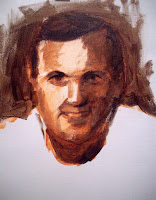
Step Three: I add a touch of white to some burnt sienna, and paint in the mid tones. I use a dry brush to blend tones a little; but try to not over blend at this point. I’ll actually be covering a lot of this up in later steps. However, since I will be glazing color over this, I don’t want my surface to have a lot of ridges. It will catch the glazes and make streaks on my painting.
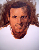
Step Four: I mix a lighter value using burnt sienna and white and paint in areas of light. I redraw as needed at any step along the way. For example, one ear was considerably higher than the other….Again, I may use a dry brush to blend a little if desired. Occasionally I like to pretend I’m Leonardo da Vinci and smear a little with my thumb or fingers, but somehow it never measures up….I just keep trying.
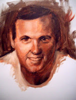
Step Five: I mix an even lighter version of burnt sienna and white and painting in highlights. I also refine tones in between.
Remember to look for the six categories of light as listed in your Day One handout:
1. Highlight: (nose, brow bone, cheek on my model)
2. Light: (turn of the cheek, forehead)
3. Shadow: (side of the nose, side of the face)
4. Core of Shadow: (right side of cheek, nose, under eyebrows)
5. Reflected Light: (right edge of jaw, neck)
6. Cast Shadow: (under nose, neck)
Helpful Hints: Always work from general tones to more specific ones. For example, don’t get caught up in details like the eyelids until you’ve created a general pattern of light and dark. I always start with the three basics: shadow, midtone (or halftone) and light, then refine from there.
Next week we will focus on adding color and color temperature to the underpainting created today
Step One: I begin with a transparent monochrome as in Day One. Keep the paint thin and washy.
Step Two: I add ultramarine blue to my burnt sienna to create a darker value. Then I paint in the shadow on my model. I add a value to my negative space (background). My paint has a little more body than in Step One, but not heavy.

Step Three: I add a touch of white to some burnt sienna, and paint in the mid tones. I use a dry brush to blend tones a little; but try to not over blend at this point. I’ll actually be covering a lot of this up in later steps. However, since I will be glazing color over this, I don’t want my surface to have a lot of ridges. It will catch the glazes and make streaks on my painting.

Step Four: I mix a lighter value using burnt sienna and white and paint in areas of light. I redraw as needed at any step along the way. For example, one ear was considerably higher than the other….Again, I may use a dry brush to blend a little if desired. Occasionally I like to pretend I’m Leonardo da Vinci and smear a little with my thumb or fingers, but somehow it never measures up….I just keep trying.

Step Five: I mix an even lighter version of burnt sienna and white and painting in highlights. I also refine tones in between.
Remember to look for the six categories of light as listed in your Day One handout:
1. Highlight: (nose, brow bone, cheek on my model)
2. Light: (turn of the cheek, forehead)
3. Shadow: (side of the nose, side of the face)
4. Core of Shadow: (right side of cheek, nose, under eyebrows)
5. Reflected Light: (right edge of jaw, neck)
6. Cast Shadow: (under nose, neck)

Helpful Hints: Always work from general tones to more specific ones. For example, don’t get caught up in details like the eyelids until you’ve created a general pattern of light and dark. I always start with the three basics: shadow, midtone (or halftone) and light, then refine from there.
Next week we will focus on adding color and color temperature to the underpainting created today
Friday, February 29, 2008
Portrait Painting at the Mint: Day Two
We are working with a limited palette: Titanium white, cad yellow med., cad red med. Ultramarine blue, burnt sienna, raw sienna (or yellow ochre) and burnt umber
Step by step example:

Step One: Transparent monochrome
Using burnt sienna (it’s warm and transparent), sketch in the structure of the face and indicate light direction. Don’t worry about details; work from the general at this stage. Your paint should be fairly thin…use a rag to wipe back into it.

Step Two: Lay in shadows. Combine a little burnt umber to your burnt sienna. Paint should be thin, but not watery. Check proportions, redraw if needed. Be sure to also address negative space…remember, you will be creating edges via value and color shifts rather than line…Reminder: shadows are warm

Step Three: Halftone Halftone is cool….I used raw sienna (or yellow ochre), a touch of cad red (or you could use alizarin crimson), a bit of white….then I added just a touch of ultramarine blue to cool it down. What you don’t want to have is green---you’re looking for a neutral that’s a bit cool.
I’m still not too worried about details

Step Four and Five: Light and some details. Light is warm. I mixed a flesh tone that was a bit on the peachy side…same combination as above, but I omitted the blue and added a bit of cad yellow.
Compared to the Rubens portrait on page one, my model’s skin tone is darker and more olive.
At this point, I allow myself to take out a smaller brush, and develop some of the details, such as the eyes. I still keep it loose.

The Final Stage: Highlights and refining. Once I’ve laid in all the basic information (as in steps 1-5), then I mix a very light, slightly cool flesh tone. Remember, white is cool, so if you add quite a bit of white to your paint, it will be cool. But, use highlights sparingly or it will turn your painting "chalky".
I also refine any other areas that need it…if the paint isn’t quite thick enough, or if I need to move a shadow slightly.
I also darken the negative space. I could certainly refine more, but this is all the time I allowed for this sketch.....
Some helpful hints: Don’t try to blend too much. Strokes of varying value and color are far more interesting than continuous tone in a portrait like this. Flesh tone is not a single color you mix up and apply to your canvas…it’s an effect you create by laying related colors side by side. .
Monday, February 25, 2008
Jiha Moon at the Mint Museum

I had the opportunity to see Jiha Moon's exhibit at the Mint on Randolph Road last week. Sometimes when you see "smart" art, it translates as boring art. Not here. There is an infectious, youthful absorption in her work....like she is discovering moment by moment with the wonder of a child. That sense of discovery is balanced by the very deliberate references to historical artisms and contemporary pop culture. I generally grimace at pop culture references....they just seem so shallow next to...well, everything. She explores them with equal zeal...I don't think she promotes the idea that one is bad and the other is not. All references are just toys in the sandbox.
I'm always pleading about quality of line to my students...and Moon uses line to it's fullest possibilities....it's descriptive, calligraphic, sexy and mysterious. Yes, I said sexy. I'm less enthralled by the color...but maybe that's just me. I think color takes a back seat to line and value in these paintings, for the most part, though Peach Heaven probably makes a liar out of me.
I'm always pleading about quality of line to my students...and Moon uses line to it's fullest possibilities....it's descriptive, calligraphic, sexy and mysterious. Yes, I said sexy. I'm less enthralled by the color...but maybe that's just me. I think color takes a back seat to line and value in these paintings, for the most part, though Peach Heaven probably makes a liar out of me.

Peach Heaven
(reprinted from www.mintmuseum.org)
And, it's a lot of fun to see someone work on such beautiful paper...yes, I know this is a nod to history, but it's so darn beautiful just on it's own. Whenever I see such beautiful paper, I think about how we often get paralyzed by the preciousness of the materials....the paper is soooo beautiful, how could one ever make something to live up to the innate beauty of the it? Obviously, this is not something Moon has to struggle with....she enhances all those qualities inherent in the paper, as well as history and infuses them with contempory references that suddenly don't seem so out of place.
It's a small show, but you can spend a lot of time looking at these. I have to admit, the Made in China exhibit doesn't do much for me, but I did notice two recently installed Eric Fischl lithographs as I walked through the permanent collection. I thought they were watercolors at first.
You can see more of Jiha Moon's work at www.jihamoon.com .
Thursday, February 21, 2008
Portrait Painting at the Mint: Day One
For the next four Thursdays I'll be conducting a portrait painting workshop at the Mint Museum. Here's a synopsis on what we will do on Day One.
Hints on lighting the model: Position a single light in front of the model, slightly to one side and slightly above the model. This is the best position to display the planes of the face, and enhance the three-dimensionality of the form. Multiple lights and full frontal lights will flatten the form, and lighting from below will create some exaggerated shadows. Look for the little triangle on the cheek opposite the light….
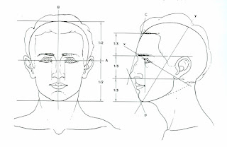
Review proportions:
Review proportions:
Guidelines for the placement of features:
Note in Fig. A that the face is divided into halves from the top of the skull to the bottom of the chin.
The eyes are the midpoint.
Note in Fig. B that the features are divided into thirds; the hairline to the brow bone is one third. The brow bone to the base of the nose is another third. The base of the nose to the bottom of the chin is another third.
Further, the section from the bottom of the nose to the chin can be subdivided into thirds, with the lips located about one third of the way down.
Note the location of the ears within the middle third of the features. Also, note the slope of the face in profile view; this may change greatly depending on the individual; there is no substitute for really looking at your model---remember, these are just guidelines.
 Find key reference points and mark them lightly on your canvas/paper. You can use charcoal, conte, or a brush. Pay attention to placement on the picture plane
Begin a transparent monochrome with thinned burnt sienna. Have a rag handy to wipe back into the image. This is when you make major decisions about drawing. Don’t skimp on this. Note the image above (by Chris Saper: visit http://www.chrissaper.com/ )
 Now let’s look at the six categories of light on this Rubens painting and note whether they are warm or cool:
1. Highlight is cool. The lightest value, cool color paint on an object.
2. Light is warm. The next lightest value, warm color paint - and it continues to get lighter still as it approaches the area of highlight.
3. Halftone (where light and shadow meet) is cool. A mid-value, cooler color paint where light begins to turn into shadow - but can't be defined as either light or shadow.
4. Shadow is warm. A dark value, warm color paint.
5. Deep Shadow (cast shadow at the origin) is hot. Darkest value, hottest color paint.
6. Reflected light within a shadow is as close to pure color as you can make it. The reflected light should match the value of the shadow and it can be either warm or cool in color.
reference: http://forum.portraitartist.com/showthread.php?t=281
Begin by mixing a warm neutral for shadow, and paint the corresponding areas on your monochrome. Your paint should be thinned a little, but not transparent. As you apply the paint, think like a sculptor---as if you are building the planes of the face. Place your strokes in the direction of the plane. I will demo mixing the colors....
Next, mix a slightly cool neutral that is lighter than your shadow. Apply this to your halftone areas.
This should take us through the first day.....see you next Thursday!
Saturday, February 16, 2008
Watercolor--Agenda and Homework from Feb. 15
Here's what you missed Feb. 15

Artists like Paul Cezanne use line and wash to explore composition, color relationships, light references. Working about 8x10” or larger, combine the two mediums of watercolor and graphite to offer a subjective view of the subject of your choice. Line and color should play equal parts in the composition.
 This painting should be loose....limit your working time to about 45 minutes to 1 hour----no more!
Class Agenda for Friday, February 15, 2008
Morning: Meet in Overcash 151/call roll/turn in homework and Scarlet project (okay, some of you want to hold onto this until the last minute....must be into me by Wednesday, Feb. 20)

Morning: Meet in Overcash 151/call roll/turn in homework and Scarlet project (okay, some of you want to hold onto this until the last minute....must be into me by Wednesday, Feb. 20)

Demo: (Future Soup, left) Composition and still life;
We will work on a still life from an unusual point of view---from above, below, or an extreme close up. Points to remember about composition:
Open composition: active; gives the impression that the composition extends beyond the edge of the picture plane. Concentrate on movement, rhythm and texture. Work on creating realistic imagery, but moving the eye through the picture plane through abstract elements.
We talked about negative space and the symbiotic relationship of positive and negative space. In short, if your negative space isn't interesting, it's unlikely that your composition will be interesting.
The demo focused on blocking in shapes and color relationships. Beginners have a tendency to jump right into details without establishing a foundation for those details.
Students then completed a still life using colorful fruits and veggies.
Homework for Feb. 22.
 Painting I: Illustration Historically, artists like Albrect Durer (far left) used watercolor to “color in” their drawings. This usually means layers of color (allow them to dry in between) and precision---so, little or no wet-in-wet techniques. Much like illustrations seen over the years.(left)
This should be postcard size or larger. Choose an object and reproduce it as faithfully as you possibly can. Try to be very objective in your representation. This will take some time; don’t wait until the day before to do it. (Clarification: Durer does introduce washes into his watercolors as well, which leads to the exploration of the spontaneous qualities of the medium, but you see this more in his landscapes.)
Possible subject matter: single flower, butterfly, insect, etc. Think images like botanical illustrations or Audubon.
Painting II: Line and Wash

Artists like Paul Cezanne use line and wash to explore composition, color relationships, light references. Working about 8x10” or larger, combine the two mediums of watercolor and graphite to offer a subjective view of the subject of your choice. Line and color should play equal parts in the composition.
 This painting should be loose....limit your working time to about 45 minutes to 1 hour----no more!
Subscribe to:
Posts (Atom)
